Uncategorized
The 1am Searcher: Who Is Really Landing on Your Website?
Picture this.
It is 1am. Someone is awake, chest tight, searching for help. They type “therapist near me” or “talk to someone about anxiety” into Google. Your website appears.
They click.
What do they see first?
If your crisis line number is buried in a footer or absent entirely, you have missed the most important clinical moment your website will ever create. Not a booking opportunity. A safety moment.
This is the design principle that Visible Therapy was built around: your digital presence is not a marketing tool. It is a clinical extension of your practice. And for mental health practitioners, that distinction changes everything, including where a crisis number lives on your homepage.
What the Research Actually Says
This is not a design opinion. It is an evidence-backed clinical standard.
Crisis lines function as a front-line mental health safety net. According to the American Psychiatric Association, crisis hotlines “serve as a core part of the nation’s mental health safety net, ensuring that care is available during a crisis.” During the COVID-19 pandemic, the Disaster Distress Helpline, a national crisis line operated by SAMHSA, saw call volume increase by more than 300% in a single month (APA, 2020).
That is not a statistic about phone lines. That is a statistic about people who had nowhere else to turn at that moment. Some of them were looking at therapist websites just like yours.
Digital access reduces barriers to reaching out. A systematic scoping review published in Psychiatric Services (2022) found that among individuals who used crisis chat services, 45% reported feeling less suicidal after a single session. The friction between a person in distress and the help they need is largely a visibility problem; they cannot reach what they cannot find.
Website design directly shapes trust and help-seeking behavior. A 2024 peer-reviewed study in BMC Health Services Research (Aguilar Silvan et al.) examined how racially and ethnically diverse college students engaged with mental health clinic websites. The finding was clear: websites that displayed important information in an easily understood, visually organized way, including how to access immediate support, generated significantly greater consumer trust and willingness to engage with services.
In other words, where you place your crisis number is a trust signal. Its position tells your visitor, before they read a single word about you, whether safety is a priority in your practice.
The Clinical Case for Position Zero
In UX and web design, “position zero” refers to the highest-visibility real estate on any page, above the navigation bar, before any scroll. It is the first thing a visitor sees regardless of their device, their intent, or how quickly they may leave.
For most websites, this space is occupied by promotional messaging.
For a mental health practitioner’s website, it belongs to the crisis number.
Here is why this matters clinically:
The person in acute distress is not browsing. They are not comparing your fees to a competitor’s or reading your bio. They are looking for a signal that this space is safe and that help exists. A prominently placed crisis line displayed calmly, in clear typography, with no sales language around it provides that signal instantly.
It models ethical practice publicly. The 988 Suicide and Crisis Lifeline was officially designated as the US national standard for crisis intervention in 2022 (Psychiatric Services, 2022). Displaying it prominently on your website is an alignment with that national standard, visible proof that your practice holds safety above conversion.
It reduces the clinical burden on your practice. Your website becomes a first-responder tool, not merely a scheduling interface. For practitioners managing high caseloads, this means one fewer gap in the care continuum.
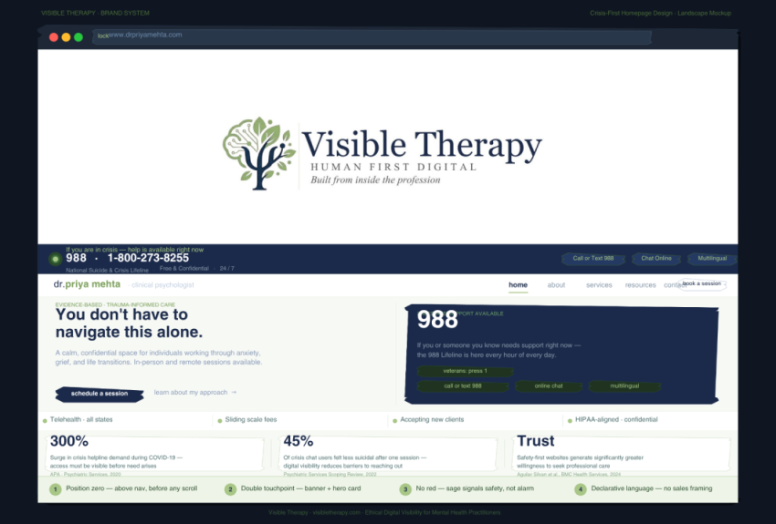
What This Looks Like in Practice: The Visible Therapy Framework
At Visible Therapy, we recommend a two-touchpoint crisis visibility model designed using the ethical principles that distinguish mental health digital presence from general marketing.
Touchpoint 1: The persistent crisis banner. A quiet, high-contrast strip at the very top of the page, above the navigation. It carries the crisis number (988 / 1-800-273-8255), the name of the lifeline, hours of availability (24/7), and modalities (call, text, online chat). The language is declarative: “If you are in crisis, help is available now,” never imperative or promotional.
Touchpoint 2: The in-hero safety card. A second, warmer presentation of the crisis information embedded within the above-the-fold section of the homepage. This is not a repetition; it is a reinforcement at a different emotional register. The banner is ambient and persistent. The card is humanizing and relational.
The language matters equally. There is no call-to-action. No “click here.” No urgency marketing. Crisis information is stated as fact because it is a fact and because the person reading it at 1am does not need to be sold anything. They need to know where to go.
Why Most Therapy Websites Get This Wrong
Standard digital marketing principles, which are built for e-commerce, SaaS products, and retail, treat every above-the-fold pixel as conversion real estate. The logic is to capture attention, generate desire, and drive action.
Applied to a mental health website, that logic is actively harmful.
When a therapist’s homepage leads with a promotional headline, a professional headshot styled like a product image, and a “book now” button before any safety information is present, it sends an unintentional but clear message to the person in crisis: this page was not designed with you in mind.
The gap between good clinical practice and poor digital practice is not a technology problem. It is an ethics problem, and it is precisely the problem Visible Therapy was built to solve.
A Note on the HIPAA Dimension
Displaying a crisis number prominently is also aligned with HIPAA-informed digital standards. Visible Therapy’s HIPAA-aligned safety framework treats crisis resource visibility as a baseline standard across all digital engagements, not a premium feature, not an optional add-on.
For practitioners building or auditing their websites: crisis visibility is not a box to check. It is the first ethical decision your digital presence makes on your behalf.
If you are a therapist, psychologist, or mental health practitioner reading this your website is making clinical decisions right now, even when you are not looking at it. The question is whether those decisions reflect your values.
At Visible Therapy, we work with practitioners to build digital presences that are as carefully considered as the care they deliver. That means no marketing language, no conversion funnels, and no design choices that prioritize visibility over safety.
It means thinking about the 1 am searcher and making sure your website is ready for them.